
Hi, I’m Scott.
I’m the President of a single family office and private trust company, an advisor to family members seeking a more authentic presence around wealth, a speaker and writer on family enterprise issues, a facilitator of difficult but generative conversations for business and family leaders, an expert on conflict and negotiation, and a Zen priest.
Recent Thoughts
Interview on Designing a Humane Family Prenup Process
How can multigenerational families design a prenup process that strengthens a couple’s relationship rather than harms it?

Using Immersive Games To Get Creative With (Family) Meetings
How many truly creative things have you done in your meetings–experiential, outside-the-box, imaginative, unusual, unexpected?
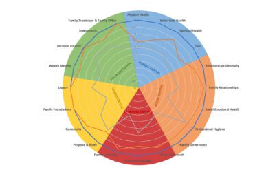
A 5 Capitals Self-Assessment Tool
I offer a PDF or Excel self-assessment tool to help individual family members determine how they are doing with human, social, learning, legacy, and financial capital.

FFI Article: The Family-Focused Office
In a recent FFI Practitioner article, I explain how the “MLF Ratio” helps distinguish truly family-focused from typical single family offices.
My thoughts, your inbox.
Let's connect.
Happenings

Intentional Family Wealth: A Conscious Leadership Intensive
Conversations around family wealth are frequently undermined by ego, secrecy, anxiety, or defensiveness. Complex emotional and motivational issues obscure shared goals and aspirations. It doesn’t have to be that way. You can shift that dynamic.
I occasionally offer 1- or 2-day facilitated workshops on these topics with my friend and colleague Sue Heilbronner. If you are interested in such a session, please get in touch.
Download the informational flyer.