I’m often in conversation with families and family office professionals about financial reporting. What graphs, formats, or presentation templates work best? How to visually explain things in ways that family members can understand? How to present complex material consistently, simply, and transparently?
In this post I want to introduce a graph that I find particularly helpful for communicating with family members about their stewardship of their financial capital over time.
As background, for me a good graphic illustrates something visually in a way that is more persuasive and communicative than can be achieved with words or numbers alone. In this case, the question to be answered visually is this: how is the family stewarding its financial capital over time? To answer that question requires a working definition of success for the family’s financial capital. What is the family’s goal for their financial capital? For most families, the answer boils down to this: at the very least, a family that wants to preserve its financial capital over time must seek to preserve purchasing power by beating inflation after accounting for taxes, fees, and spending or charity. I call these (inflation, taxes, fees, and spending or charity) the “four horsemen” of the apocalypse. They are the forces against which a family seeking to preserve financial capital must struggle. A family may seek to do better than this financially, but if it seeks to preserve financial capital for future generations, this is a floor on what must be accomplished.
There is a lot in this definition. It is relatively easy to say “yes, our goal is to beat inflation after accounting for taxes, fees, and spending or charity,” but it is remarkably hard to do (and few families, in my estimation, actually do it). Thus the need for a good visual representation of how the family is doing on this complex task.
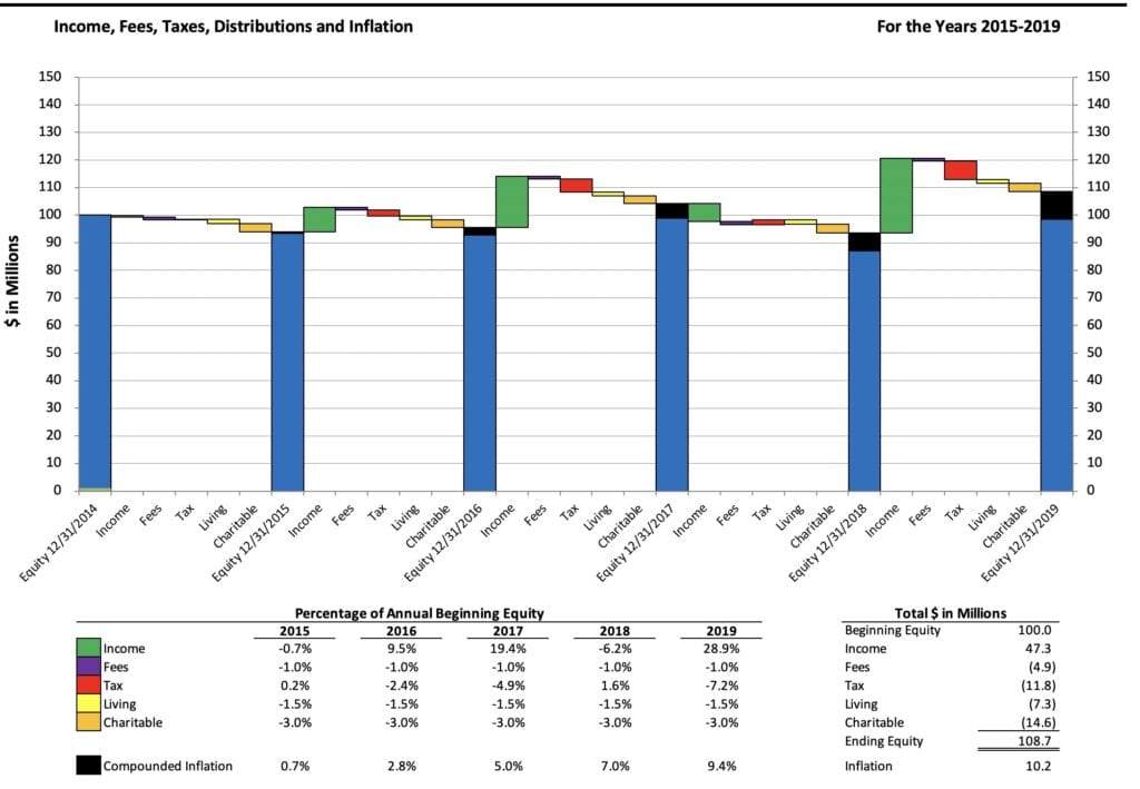
Figure 1
Figure 1 shows the four horsemen in a simple bridge graph. The green bars represent income (or investment losses) in a given year; red represents taxes; purple represents fees; yellow represents distributions made for living expenses; orange shows distributions for charitable donations. Finally, the black bar (inside the blue equity column) shows the creeping impact of compounding inflation.
In other words, Figure 1 shows sources and uses, as well as the effect of inflation, all at once. In this example, it is immediately clear that this family is not preserving purchasing power over time. Instead, taxes, fees, spending, and particularly inflation are eating into the family’s financial capital. At the end of 2019, the family has less–adjusted for compounding inflation–than it did at the start of 2015.
A family might not set their baseline or minimum goal in the same way–they might not be concerned about losing purchasing power over time, on the one hand, or might have higher aspirations than merely maintaining it, on the other. Regardless of their goal, however, this stewardship graph can train a family to track both their inputs and outputs regularly. For almost anyone, this graph shows how a family’s financial capital is doing over time.
Personally, I find this the most important financial graph that a family can use regularly. It sums up the stewardship problem in one simple place by showing both income (or returns) and expenditures (for various purposes), as well as inflation’s slow effects. That said, I will end with an invitation: if you have another financial graph or visual that you like better, please let me know! I’d like to compare notes.
[If you’d like to play with this graph, you can download the Excel spreadsheet herehere. Enter your own figures in the blue cells on the Data sheet.]
Photo by Lukas Blazek on Unsplash